
Throughout the pandemic, many of us at Cloudberry have turned to our devices to help us maintain and improve our overall health and wellbeing. We decided to take a deeper dive into what makes our favorite health apps shine—specifically with regards to UX.
Pillow
Pillow is a sleep tracker that uses your iPhone (and Apple Watch if you have one) to monitor your sleep, providing in-depth analysis and a breakdown of your sleep quality the following morning. It also allows you to set a smart alarm that will wake you at your lightest point of sleep based on your sleep cycle. Additional features include sleep aid sounds and meditations, iCloud sync and backup, mood tracking, and more.
Onboarding
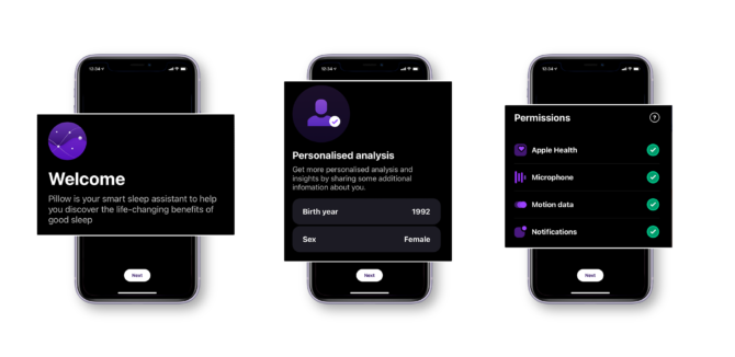 Image Source: Pillow app
Upon opening the app, you are presented with a set of welcome screens that are easy to follow. Pillow helps you set up all the various permissions and settings you need to address on your iPhone to let the app function at its best, allowing you to get all the busy work out of the way at the beginning. We like this approach from a UX perspective because it allows you to enjoy the app to its fullest potential without interruptions once you’re finished with the initial setup.
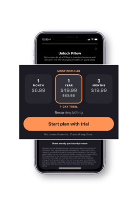 Image Source: Pillow app
Next, the app displays the standard ‘opt-in to premium’ screen. You can exit this popup without committing to any of the subscription options, allowing you to explore the app further before making any sort of financial commitment. We appreciate the non-invasiveness of this approach and giving the user control over if and when they decide to upgrade.
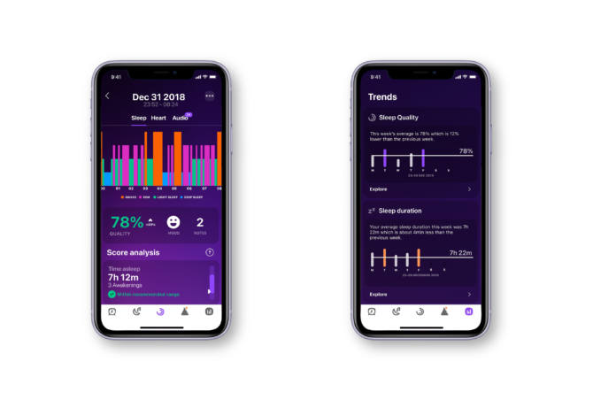 Image Source: pillow.app
App Layout & Design
We love the overall look-and-feel of the Pillow app. The use of rich purple gradients in both light and dark modes, smooth animations, easy-to-read charts, and minimalist iconography creates the exact mood you want as you’re preparing for bed.
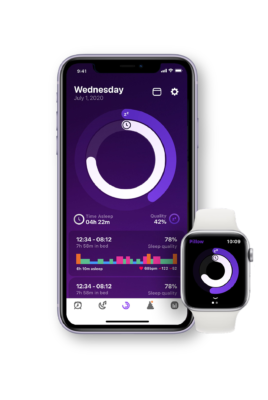 Image Source: pillow.app
Every time you open the app, your latest sleep results are right there for you to review. There are two circles displayed front and center—the outer circle represents overall sleep quality, and the inner circle represents the sleep duration. Below those circles, there’s a bar graph showing the different sleep stages along with the duration of time for each stage, allowing the user to get an even more detailed look at their previous night’s sleep. The colors are bright and vivid and contrast nicely against the app background.
Accessibility
Pillow offers both light and dark modes—both of which cater nicely to using the app at night. We’ve also found that the app is mostly accessible using VoiceOver, which reads through the page elements. Additionally, most buttons are clearly labeled — however, we found the menu items at the bottom of the app to be a little unclear due to having only iconography and no labels. Otherwise, the app uses good color contrast and VoiceOver capabilities to cater to its users’ accessibility needs.
MyFitnessPal
MyFitnessPal is one of the top calorie-counting apps on the market. It combines a comprehensive set of features that differentiates it from its competition—a massive database of foods for logging, an online community, exercise routines, and tons of integrations to make it a one-stop shop for taking charge of your health and wellness.
Onboarding
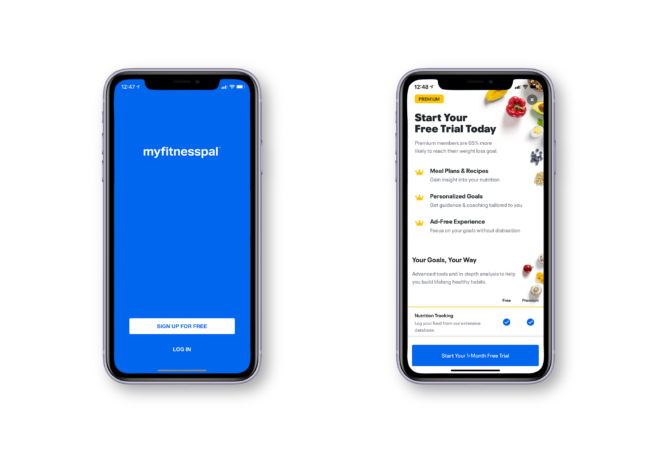 Image Source: MyFitnessPal app
MyFitnessPal requires you to have an account to access the app. Once logged in, the app presents a screen explaining the benefits of having a premium plan, which includes a 1-month free trial. After either opting in or leaving that screen, you are then presented with a social media feed, containing various recipes, ads, and blog posts. What we like about this setup is that it gives the user content to look through from the very start, which is especially useful when there isn’t any data logged yet. Some of the content may even inspire the user to set good habits and start logging data right away.
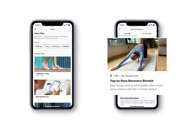 Image Source: MyFitnessPal app
The app offers a ton of different features beyond just calorie counting, which was their main draw when they first launched back in 2005. They offer various plans to help you stay on track with your goals, and they also make it simple to log various data—weight, water intake, status post, food, or exercise. The large blue plus sign in the bottom menu pulls up these five logging options, and each of these options lead the user to a new page where they can focus solely on adding their data. We also like that this button is accessible from anywhere in the app. Some bonuses to MyFitnessPal that we think add to its overall UX are that you can scan certain food items to help automate the calorie-counting process, and that the exercise component offers built-in exercise routines so that you don’t need to leave the app to tackle multiple areas of wellness.
App Layout & Design
MyFitnessPal is a very robust app, offering a whole social media component and built-in exercise routines on top of food logging.
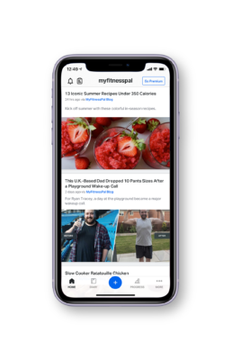 Image Source: MyFitnessPal app
For those who like having all their health and fitness tracking in one place, this is a great option. The social media aspect of the app allows people to motivate and hold each other accountable, even though this is not the central feature of the app. There are tons of forums to choose from if you’re someone who is motivated by others’ success stories, and you can follow friends to share your progress with one another, but if you prefer to go it alone, the home feed still has plenty of useful content to scroll through. We really like that MyFitnessPal has found ways to engage users before they even begin logging their own data.
The ads that are peppered throughout the app can get a bit distracting from a UX perspective, but if it allows people access to the app for free, then it may be worth having them around. We do think that to have the best user experience, premium would be optimal so that you can use the app to its fullest without having ads getting in the way.
Accessibility
Something that sets MyFitnessPal apart from its competitors is that it can be used as an app or via a standard web browser. Both the website and the iPhone app are accessible using screen reader software and VoiceOver, although we do find that the website design is a bit dated and less engaging overall.
Lose It!
Lose It! is a weight loss app that sets personalized goals for you, tracks your diet, food, and exercises to reach your fitness goals. It offers features such as a barcode scanner for food logging, fitness app integration, gamified challenges, personalized meal planning, recipes, and workout guides.
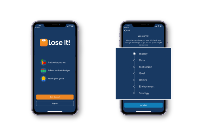 Image Source: Lose It! app
Onboarding
If it’s your first time opening the app, you will navigate through a series of welcome screens to help personalize your account based on your weight loss goals. The series of questions prompts you to reflect on past weight loss journeys, what worked and what didn’t, and what may be different about it this time around. It’s an extensive welcome journey, but the thoroughness allows the app to get to know you so it can help you reach your goals. The questions were all multiple choice, making it easy to quickly get through them without sacrificing the quality of the answers. After finishing all the questions, the app presents a variety of weight loss plans, which vary from relaxed all the way to vigorous. Based on how you answered the questions, it will recommend a certain path for you to take, and once you select a path, you are then prompted to create an account.
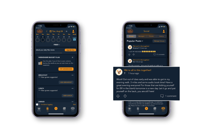 Image Source: Lose It! app
App Layout & Design
Given how many features Lose It! has, we find the app to be well-organized and easy to use. One thing we noticed that felt a bit odd was that every time you open the app, the page shown is whichever page you were viewing last. Ideally, the app would showcase the first tab, “My Day”, since that displays a summary of your calorie intake as well as reminders to complete the daily tasks.
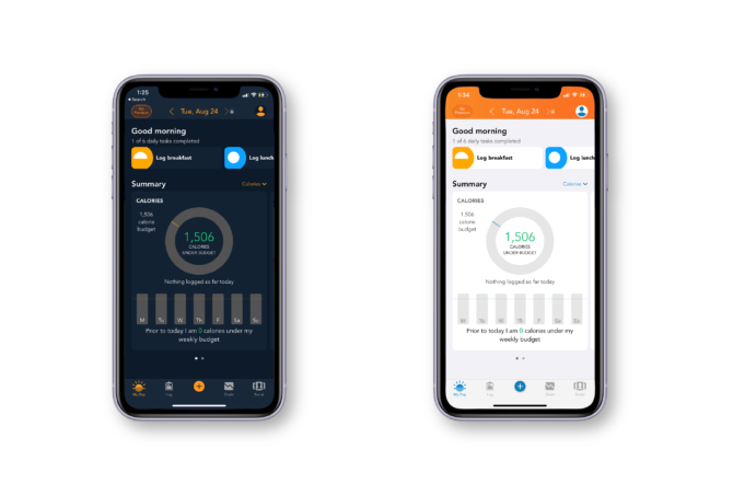 Image Source: Lose It! app
We really like how the menu icons along the bottom of the app are accompanied by text labels. Some of the scrolling functionality is a bit wonky in certain areas, but nothing that a quick app update wouldn’t be able to fix. With the iPhone in dark mode, Lose It! has a lovely interface, with their branded orange color peppered throughout and nicely contrasted with a deep blue. However, we find the app’s design for light mode to be a bit dated, with the gradient block at the top and odd text drop shadows to add contrast for legibility.
Accessibility
Similarly to MyFitnessPal, Lose It! can also be used in a standard web browser in addition to the app. However, the web browser version is very outdated, and we imagine this is due to most of the user base utilizing the app only on their smartphones.
The iPhone app is accessible using VoiceOver, but the web version of the app needs a good deal of improvement. Many of the page elements are not labeled with necessary descriptions, so the screen reader can’t specify what the user is highlighting.
There are so many health and wellness apps out there for people to try, and there’s not a one-size-fits-all solution for everyone. When it comes to providing users with an optimal experience so that they can best achieve their health goals, the UX of the app is crucial—especially since health and wellness can be tricky for many people to prioritize.
When it comes to determining what constitutes as good UX for health apps, we think some of the best practices involve removing as many obstacles as possible, displaying results in a digestible and enticing way, and giving the user optional add-ons to enhance their experience. We think the above apps all do a fantastic job of initial onboarding, helping the user focus in on their goals, presenting the data in a helpful way, and giving the user some control over how they use the app. If you’re someone who is on the lookout for a new health app to try, we highly recommend checking out the above.