
It’s that time of year again where we find ourselves anticipating what the future holds for the design world. We’ve been enduring a pandemic for over two years now, with our sense of normality constantly shifting as each month goes by. In many ways, including through the eyes of design, we’re looking for ways to return to the past while also forging ahead towards a changed future.
But before we talk about the future, let’s talk about some of the nostalgia we’ve been seeing more and more of on the web.
90s Nostalgia & Frasurbane
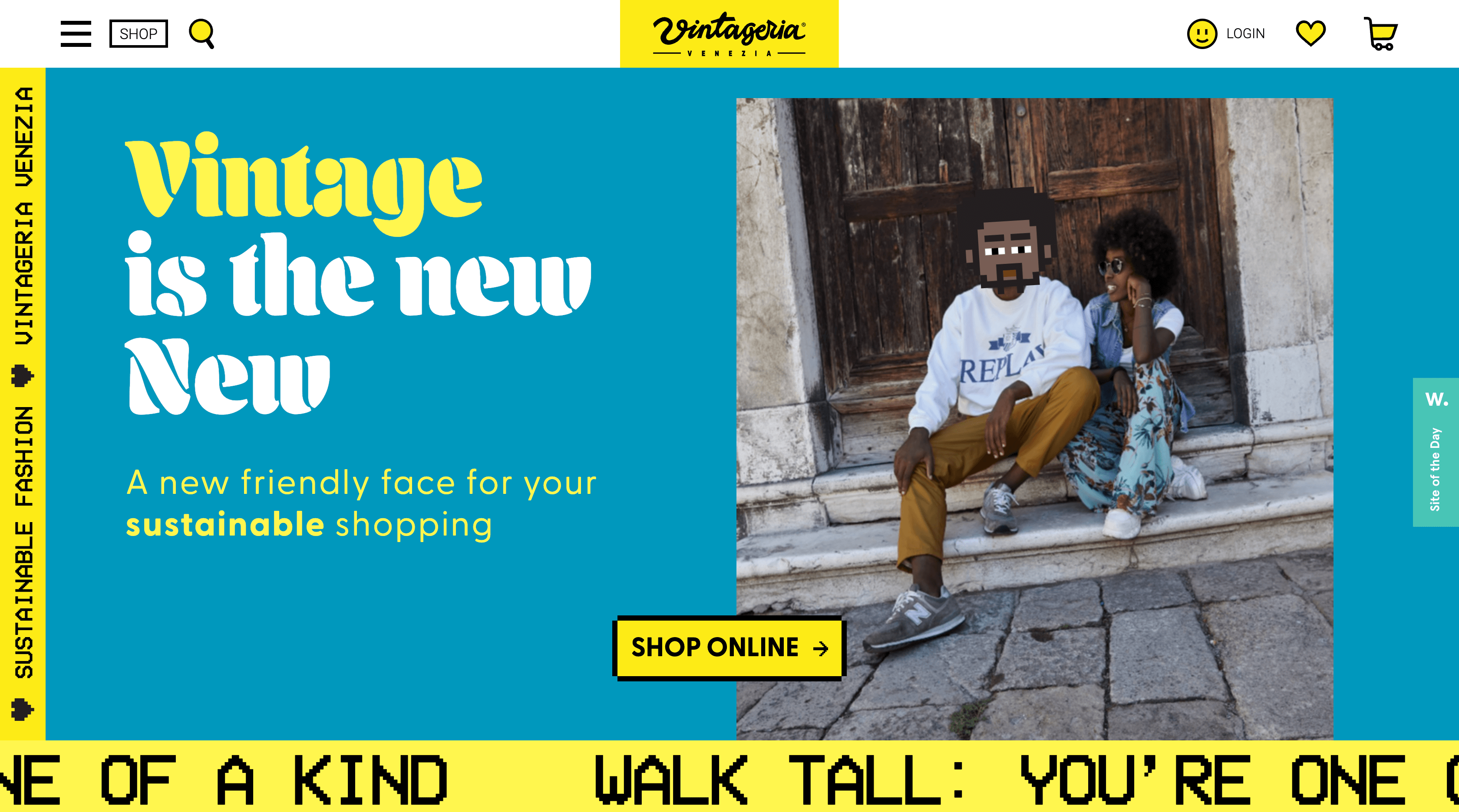 Image Source: Vintageria
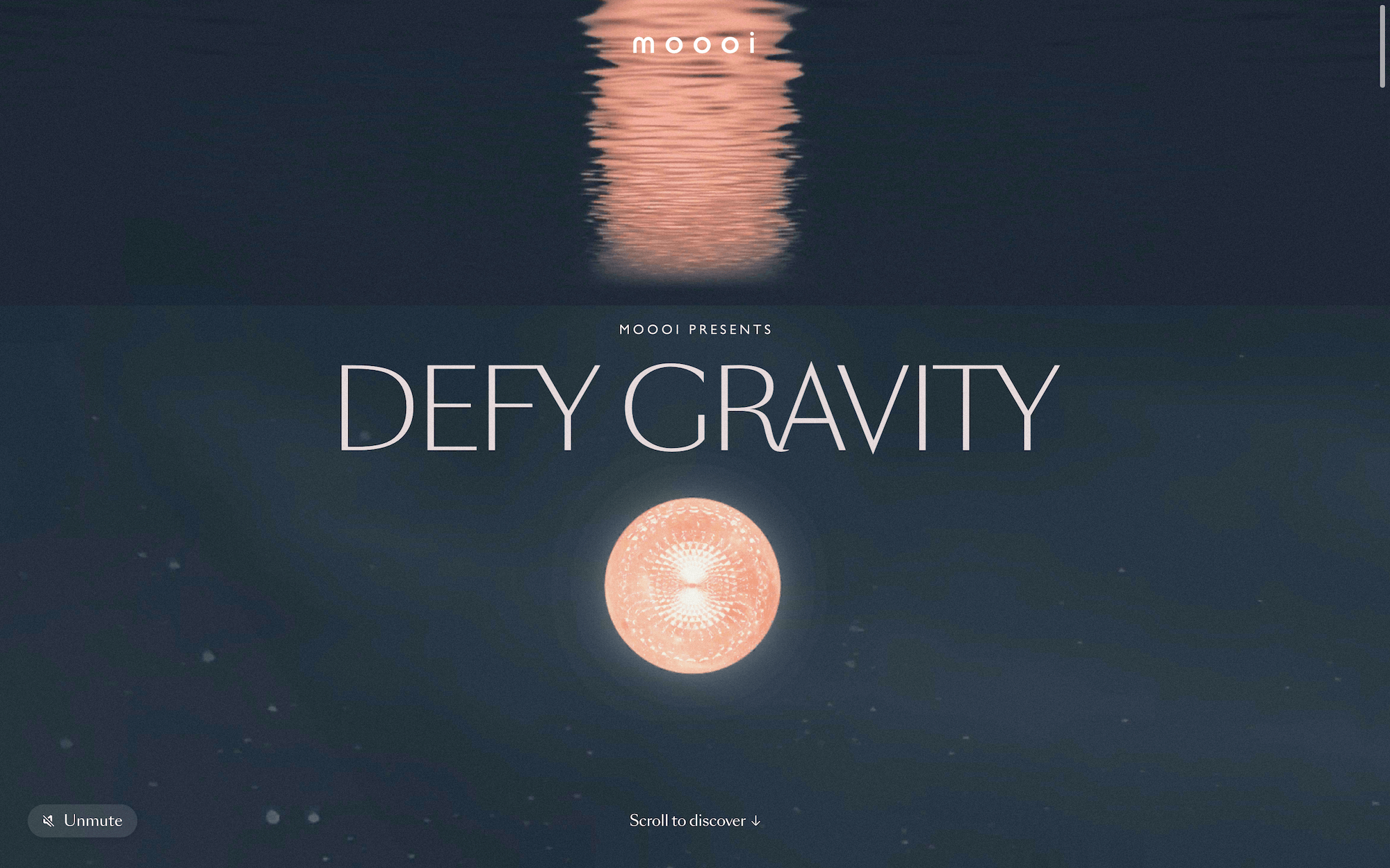 Image Source: moooi
Retro design is by no means a new concept on the web — however, a lot of what we imagine as retro design tends to reference decades such as the 70s, and yet recently, we’ve seen a huge upswing in the use of 90s nostalgia. Besides the fact that it’s sobering to think of the 90s as a retro decade now, it’s been fun to see all the ways in which the 90s have been brought back to life. Think “Memphis design patterns, simple emojis, a primitive internet look, bright color blocks, grainy textures and pixelated art” as some of the featured elements in these designs (Creative Bloq).
In an entirely different direction, but still very relevant to 90s nostalgia, is this concept of Frasurbane — “a portmanteau of the 90s American sitcom Frasier and the word ‘urbane’” — which can be recognized as an homage to interior décor. A combination of elegant serifs, muted color palettes, and thoughtfully placed design elements create a sophisticated look-and-feel that is both modern and nostalgic.
Even Larger Typography, Neo-Brutalism, & Anti-Design
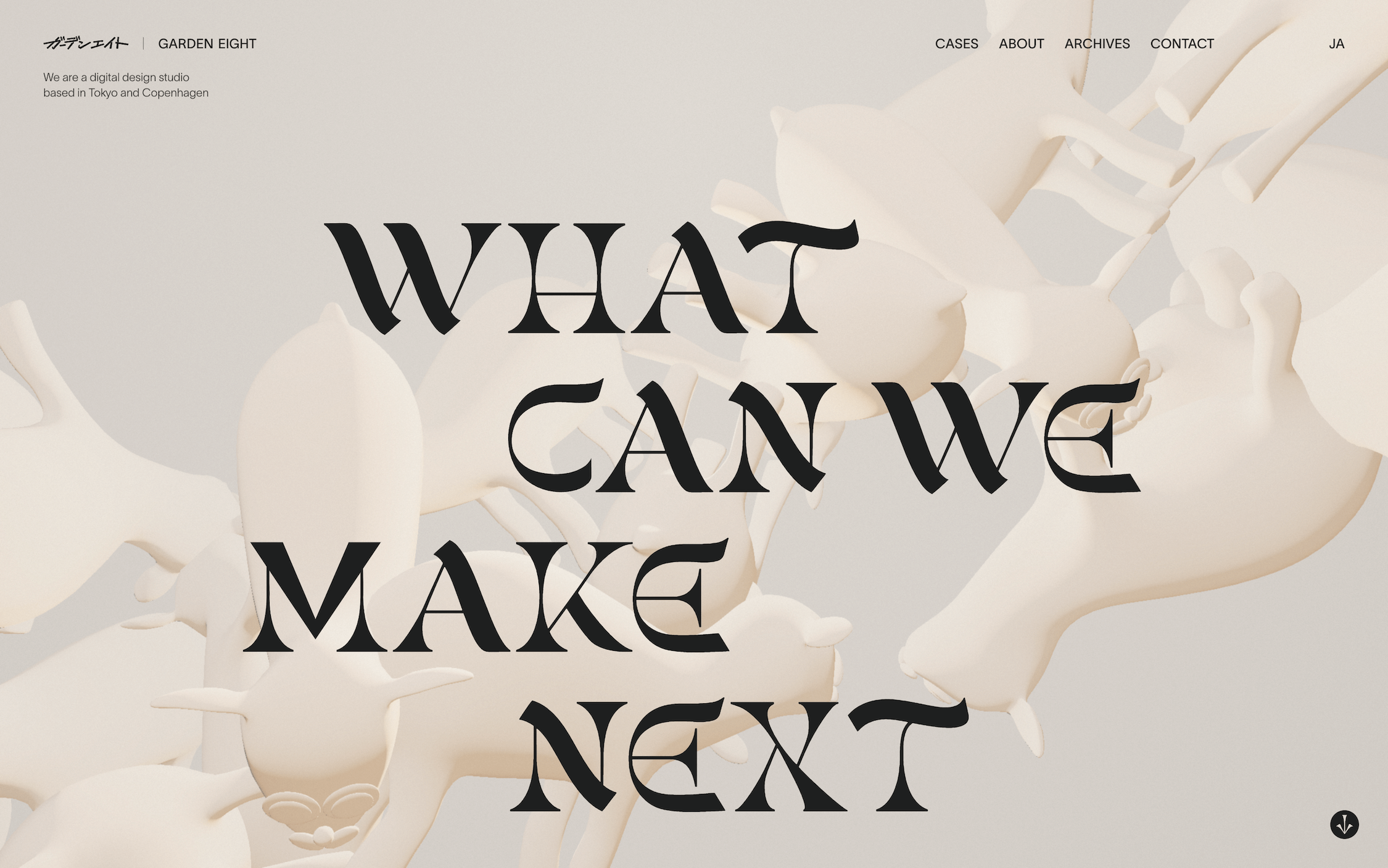 Image Source: Garden Eight
We’ve seen large typography take hold over the past few years, and that trend isn’t going away anytime soon; in fact, it’s at the forefront even more this time around. We’re seeing less and less imagery being used in hero sections, making room for large type to take the stage. This bold approach is a surefire way to catch your audience’s attention and to communicate messages effectively — that is, if you’re maintaining legibility. We have seen instances of large typography bordering illegibility, but in those cases, it’s often an intentional artistic decision. However, given our focus in accessibility, we can’t recommend taking such a route in good conscience.
In the same vein, we’re continuing to see a lot of brutalism utilized in web design, which thrives on “asymmetry, clashing colors, bare interfaces, crowded elements and stark typography” (99 Designs). Yet this newer wave, sometimes coined as Neo-Brutalism, seems to be respecting the grid a bit more and allowing for more whitespace. We’re a fan of this subtle shift if it means that these websites are easier to navigate and more user-friendly.
Lastly, under the same brutalist umbrella, we’ve found that there’s more of a growing Anti-Design movement, which can ultimately take many forms. But what ties it all together is that it’s a brutalist response to the homogeneity we’ve been seeing, specifically due to the latest design conventions that have focused primarily on usability. While we hope that these Anti-Designs still prioritize usability and accessibility, we applaud the growing diversity in web design as a response.
Inclusivity & More Sophisticated Eco-Consciousness
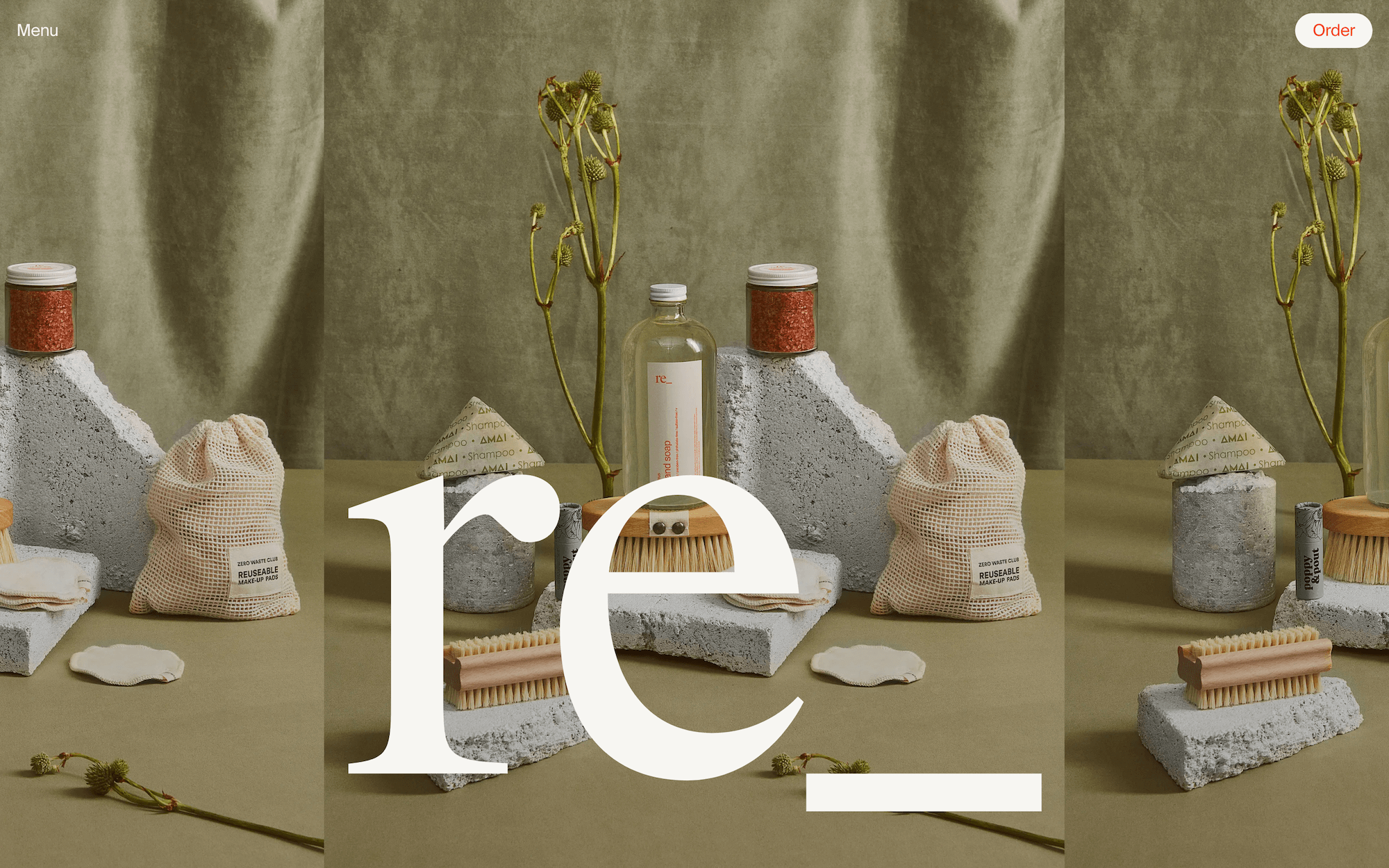 Image Source: re grocery
This trend is one of the more forward-looking directions we’ve seen, which we are particularly excited about. We’re noticing more of a meaningful, authentic shift towards inclusivity in design. This is a tricky balance to strike, because more often than not, designs that prioritize inclusivity can come across as performative. Yet we’re seeing a comprehensive movement towards diverse representation in imagery and language.
Similarly, we’re finding some welcome deviations from the stereotypical eco-conscious web design. Instead of the traditional bright greens and nature icons that you’d expect, these designs are focusing more on a handmade feel — almost to distance from technology itself, despite the irony of being viewed on technological devices. “Backgrounds are usually greyish to resemble a recyclable cardboard. Typography is minimal in style. Contrast is high. Colors are quite strict and seem ‘dimmed’… this style embraces real life photography, real life textures and doodles.” (UX Design) After nearly two years of working remotely and connecting with one another via Zoom, these designs motivate their audiences to pay attention to what’s around them.
Ukiyo-e Flat Design & Handmade Graphics
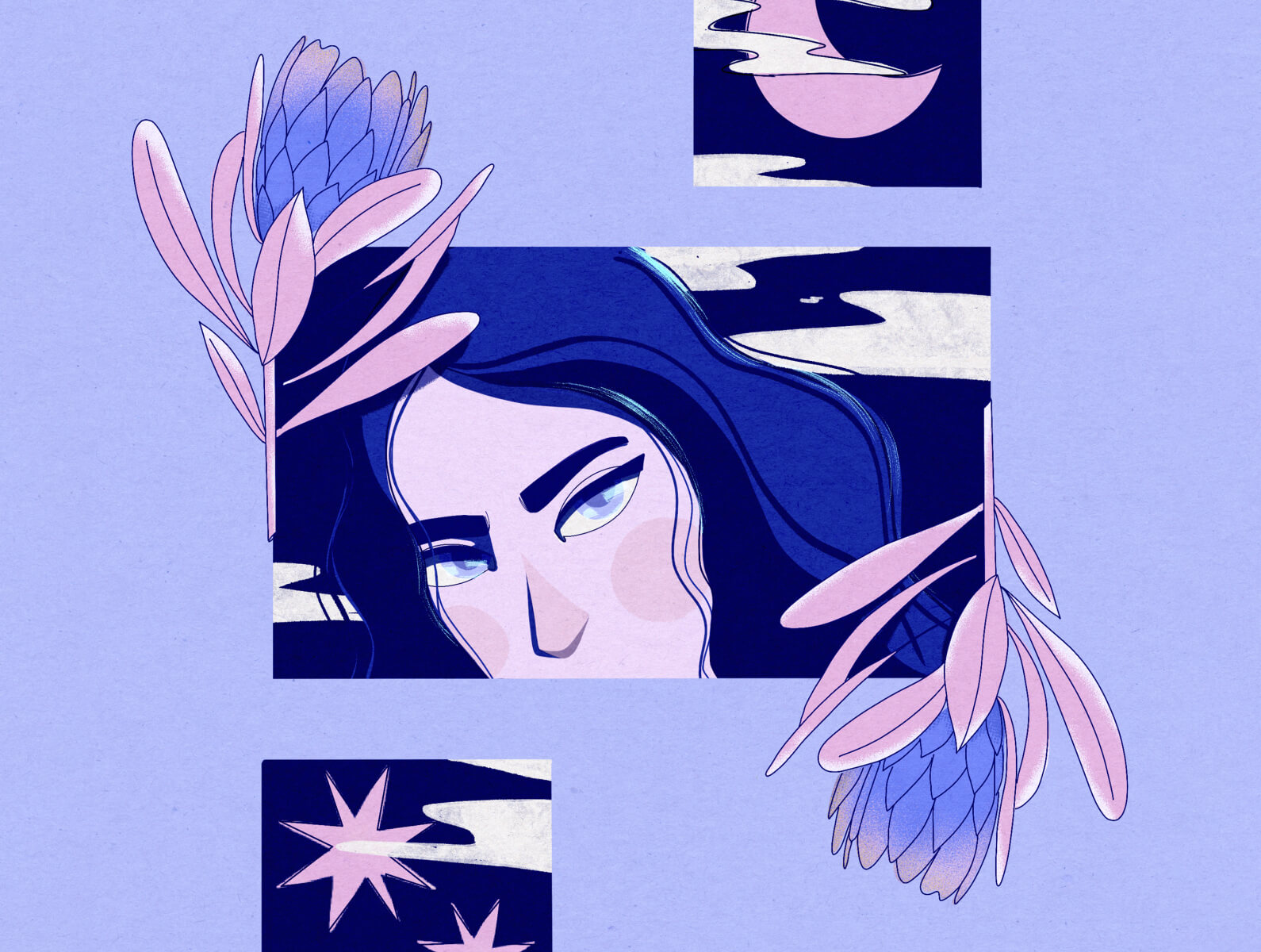 Image Source: Dribbble
When we think of flat design, we tend to think of 2012 — the infamous era of Windows 8 and iOS 7. But fortunately, this new design trend does not take us back to those days where everything was on the same plane. Ukiyo-e flat design incorporates a handmade texture to it, adding whimsy and beauty to the mundane (which is especially needed in today’s world.) “[It] is a style of printed artwork (though it was sometimes painted) using hand-carved woodblocks… It often featured bold outlines, flat colors and limited perspective techniques—all of which are familiar to the vector designers.” (99 Designs).
These handmade elements, in addition to other techniques such as handwritten typography, hand-drawn doodles, and texture added to graphic elements, bring a sense of vibrancy to designs that would otherwise feel lifeless and drab.
Glassmorphism
 Image Source: Dribbble
Over the past few years, we’ve seen a growing trend of neomorphism, which is the intersection of skeuomorphism and flat design that we’ve become quite accustomed to. An even more specific direction of neomorphism has taken off however — Glassmorphism — and it’s exactly what you might think it is. Designs that take this approach will focus on a glassy effect, making these designs feel more modern, whimsical, and bright, adding dimension without appearing too harsh. “There’s a background blur, semi-transparent objects like cards, “watercolor”, glass-looking spheres and more” (UX Design). We see much of this in today’s latest OS designs (Big Sur and Windows 11), and we expect to see it implemented in more designs as the year goes on.
Animated Logos
 Image Source: Dribbble
Something you may have noticed more recently is the presence of animated logos. These allow brands to add interest and variation to their existing logos without needing to rebrand. And yet, those who could use a rebrand are inspired to update and simplify their logos as well so that they’d have the freedom to animate down the line.
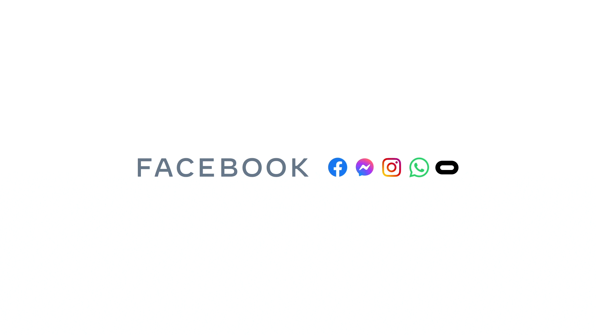 Image Source: Meta
A great example of a highly effective animated logo is Meta. They use their animation to cross the boundary between 2D and 3D, highlighting their logo as both remarkably simple and mathematically complex.
We think this is a great route to take if you’re trying to spice up an existing design and don’t have the resources to add in scroll animations or interactive elements on the webpage. A logo animation is an easier way to add more visual interest while raising brand awareness and grabbing the audience’s attention.
What’s Next?
 Image Source: Wikimedia
In more recent news, the emergence of NFTs and the Metaverse are absolutely changing the game when it comes to the design world. NFTs allow for the democratization of art, and with them booming in popularity, we may continue to see all sorts of designs come out of the woodwork. And the Metaverse is something we haven’t had to design for before, so we’re curious to see how that pans out as time goes on.
NFTs are still a new and confusing concept to many, but there are lots of excellent resources online for those who want to learn more. One organization we recommend is called BFF, and it is a crypto community aiming to educate more women and non-binary folks on how the crypto world works, especially since it is overwhelmingly male-dominant at the moment. Even for those who don’t plan to participate in the world of NFTs, we encourage educating yourself since it won’t be going away anytime soon.